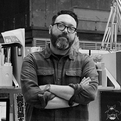
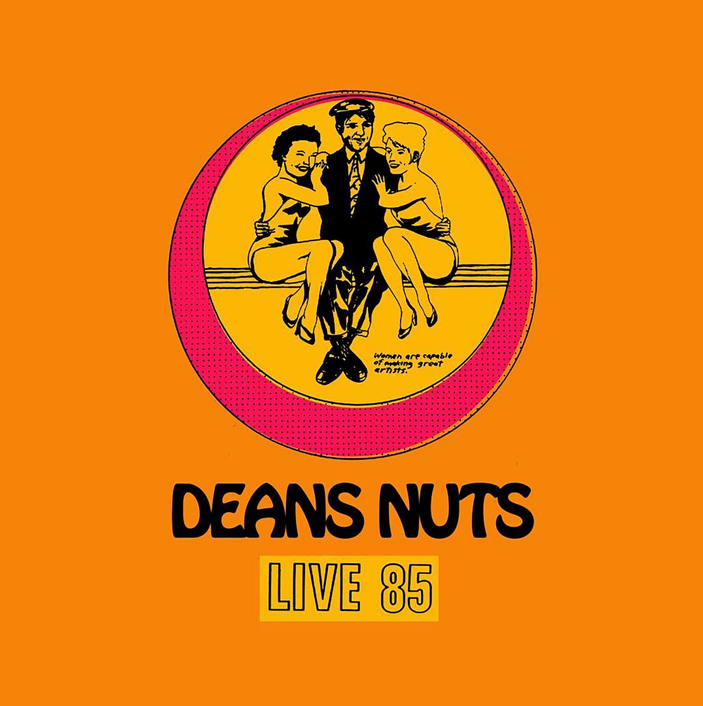
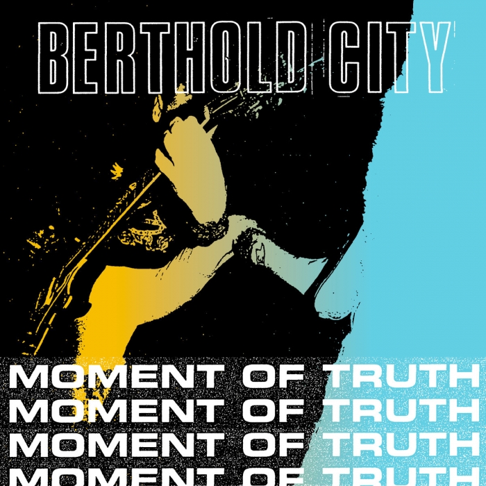
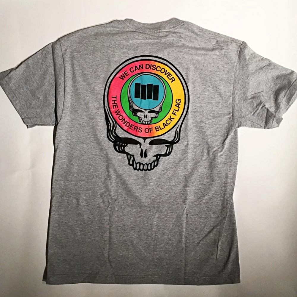
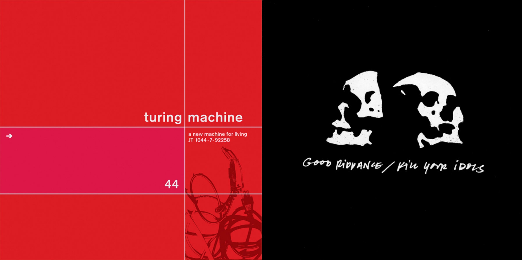
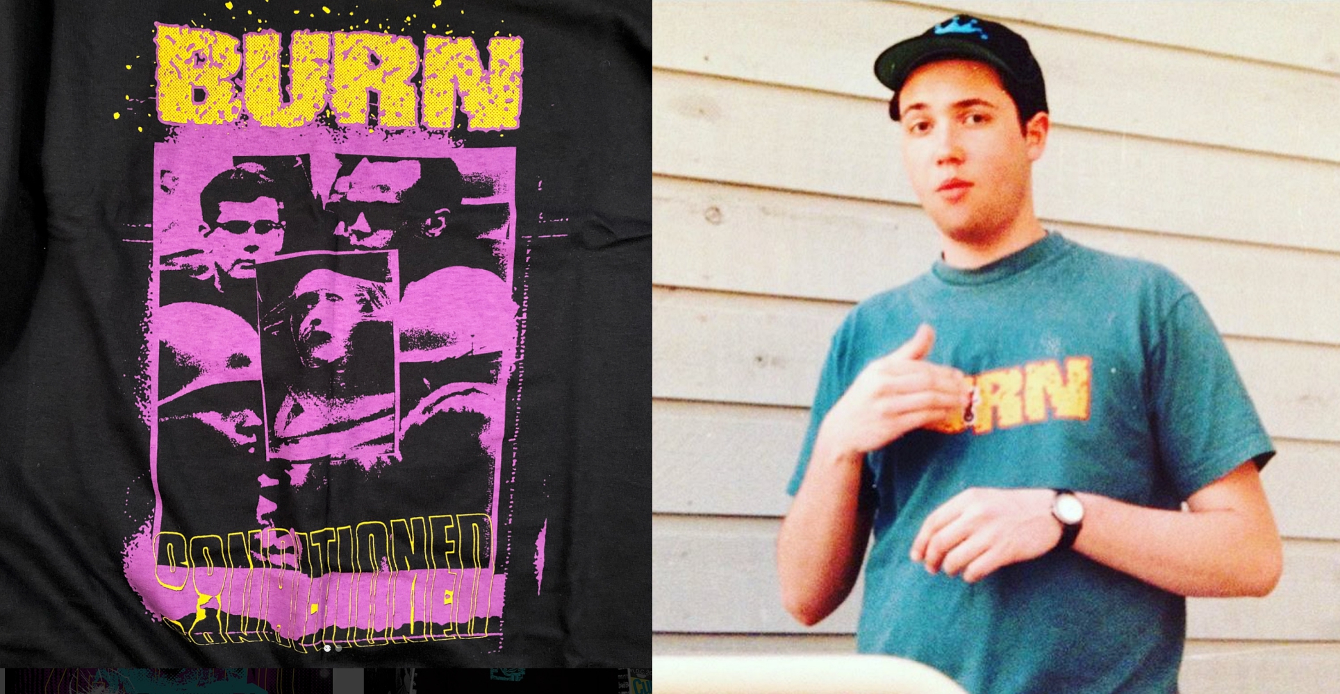
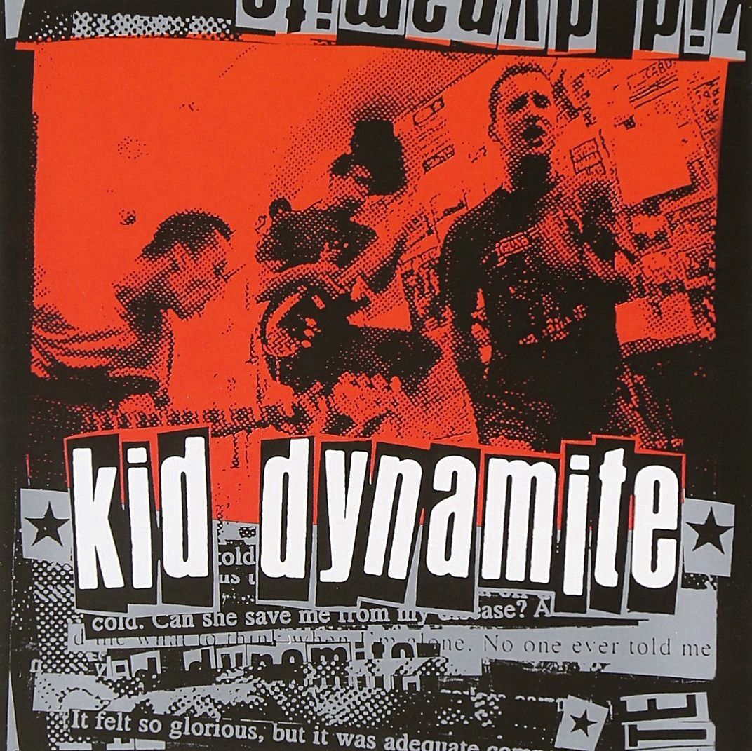
The chances are you probably don't know who Jeremy Dean, aka Deansnuts, but I can almost guarantee you've seen his design work. The whole Black Flag meets Grateful Dead thing? Yep, that's Jeremy. If you're a fellow hardcore music geek, you've seen his graphic work for such bands as Turning Point, Berthold City, Kid Dynamite, and Burn throughout the years. Whether it was something he created during his time working at Jade Tree, or his mash-up-styled designs, Jeremy's visual aesthetic has been highly influential within the hardcore community.
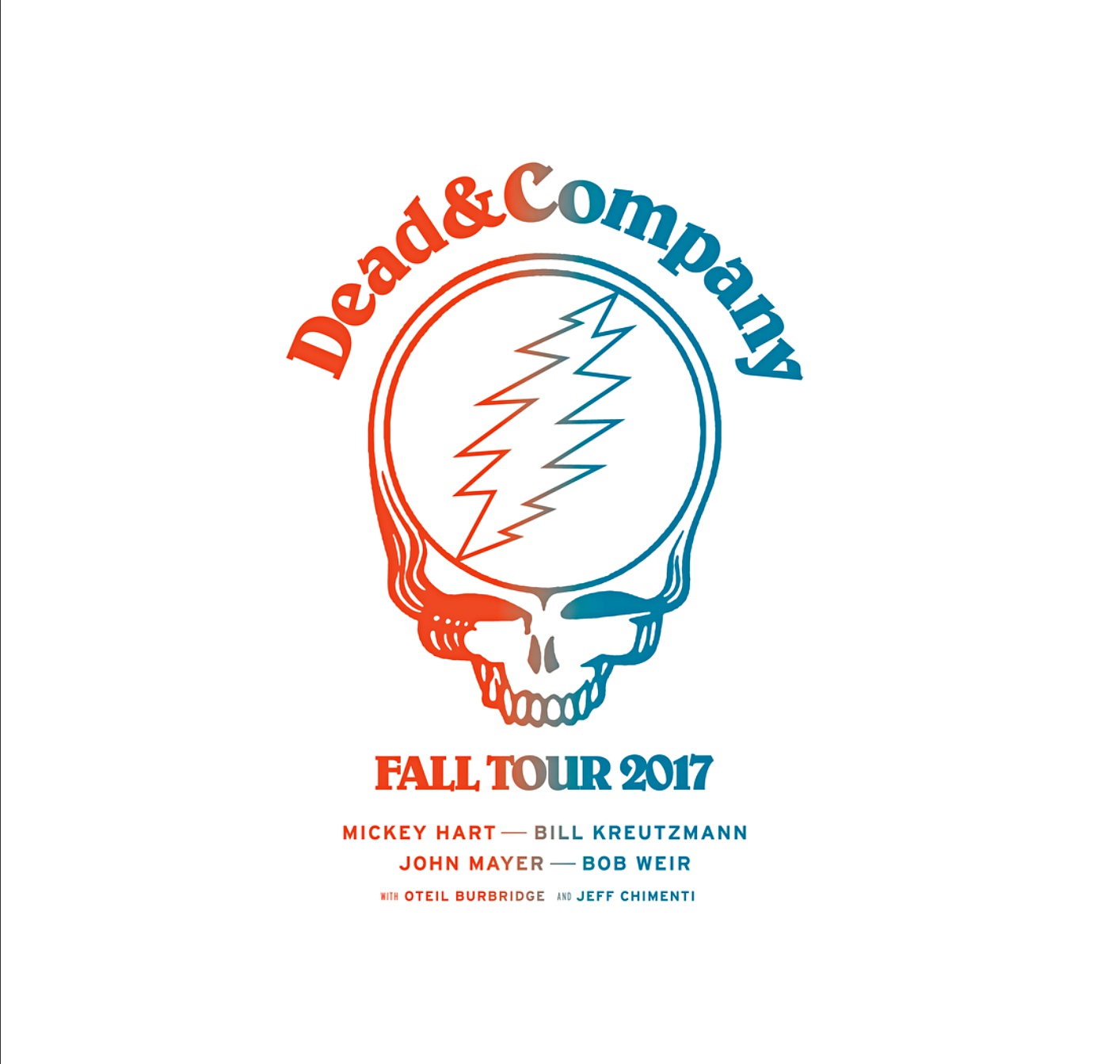
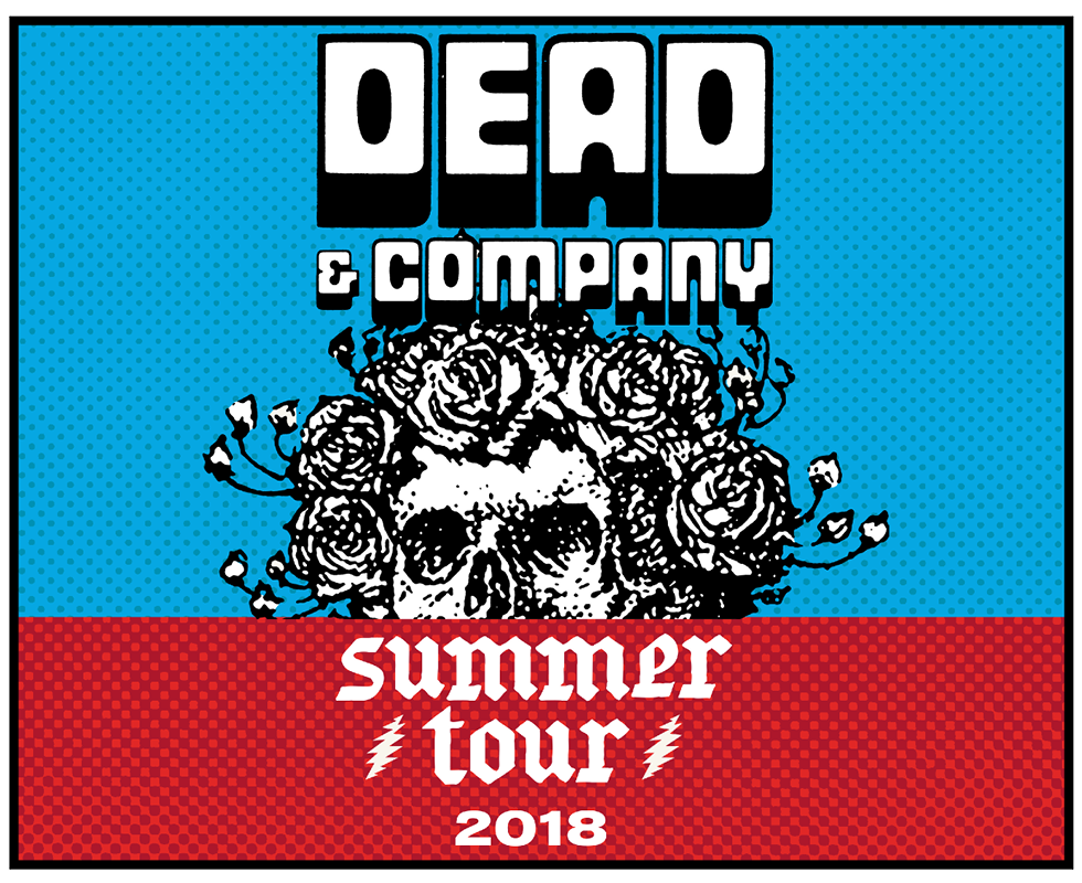
A fan of the Grateful Dead, Jeremy also works with offshoot band Dead & Company, creating everything from poster art to t-shirts to a myriad of other merchandise items. Other music clients of his include John Mayer, St. Vincent, and Canadian pop singer Shawn Mendes.
In my endless quest to document the various facets of hardcore, its ecosystem, and the talented people who make it all possible, I knew I had to speak with Jeremy about his upbringing, influences, and his thoughts on the current state of the scene as it pertains to design.
Where were you born and raised? What kind of upbringing did you have?
I was born in Philadelphia, raised right outside the city in a town called North Wales. I had a pretty normal (for lack of a better term) childhood. Spent lots of time outside playing, riding my bike, playing in the woods, playing little league, and swimming on the local swim team. Then I started skateboarding an that all went out the window.
When did music first knock you on your ass? What kind of style of music did you first gravitate to?
When I was about 4 I saw KISS on TV and I was instantly mesmerized. From then on I was obsessed. I made my parents buy me the records for my birthday and Christmas and get me an iron-on shirt with the KISS Alive cover on it. They appealed to every part of my brain. They looked like cartoon characters, they were kind of scary, but not really that scary. There was fire, there was blood. From age 4 to about age 9/10 I was obsessed with them. I’m still a fan of that '73-'78-era KISS. I own a KISS pinball machine, if that tells you anything.
Who were some of the first hardcore bands you saw and if you had to pick a favorite from that era, which band would it be?
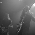
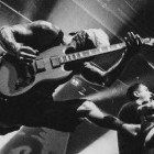
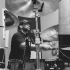
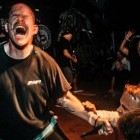
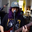
Early hardcore shows for me included seeing MDC, McRad, Pagan Babies, Insted, Turning Point, Release, Supertouch, 7 Seconds, Vision, Bad Brans, Leeway, Upfront, Chain of Strength, Judge, Gorilla Biscuits, etc. I was going to shows at places like Club Pizzaz and The Revival in Philadelphia, City Gardens in Trenton, NJ, and the Unisound in Reading, PA.
Some of my favorites at that time were Supertouch, Pagan Babies, Turning Point, and Bad Brains. Hard to pick just one!
When did you start designing? Did you do the physical, cut and paste early on and then move on to computers?
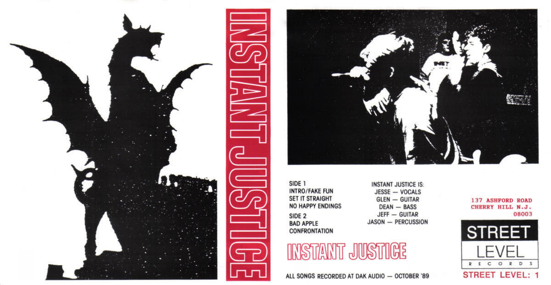
I started making fake 7˝ covers and working on zines as soon as I got into hardcore at around 14. I designed a zine with my friends when I was 16 and then I designed an EP cover from my friend's band called Instant Justice when I was 17. I laid it out using traditional mechanical techniques with a blue line board, stat camera, and wax roller for adhesion of the graphics to the board. I did tissue overlays to mark off colors for the pressmen.
I learned this stuff in the summer working for my father who has a small printing and advertising business. I would clean up around the shop and work on a paper folder and shrink wrapper during the day, and as I waited for him to be done, I would hang out in the art department and mess with press type and the stat camera. (Those are things that designers used pre-computer)
There’s a powerful and elegant simplicity to a lot of what you’ve designed through the years. Where did that come from? Who were you’re design influences?
Thank you. I’m not sure anyone has described my work like that before. I like it!
So much of what I do really comes from years of looking at skateboard graphics and record covers as well as zines, then filtered through people like Josef Muller Brockmann, Saul Bass, Paul Rand, and Neville Brody. David Carson-era Transworld Skateboarding had a profound effect on me wanting to become a designer as well.
You worked at Jade Tree for many years, and created the label’s visual identity through its peak era. How did that gig come about and how much freedom did you have working there?
While I was working at the Delaware type foundry House Industries, I asked Tim [Owen] and Darren [Walters] at Jade Tree to hep with a project. As we became friends it just started to grow. I really wanted to do record covers, I had for years, but at the time I wasn’t really friends with many bands or labels. Once I got to know Tim and Darren the world kind of opened up, plus I kept telling them I wanted to do record covers, so they finally gave in. They gave me total freedom. The bands sometimes didn’t, but that’s part of the process. I was able to produce a body of work that I’m still proud of while working for them. It was a ton of fun.
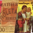
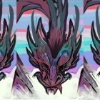
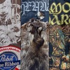
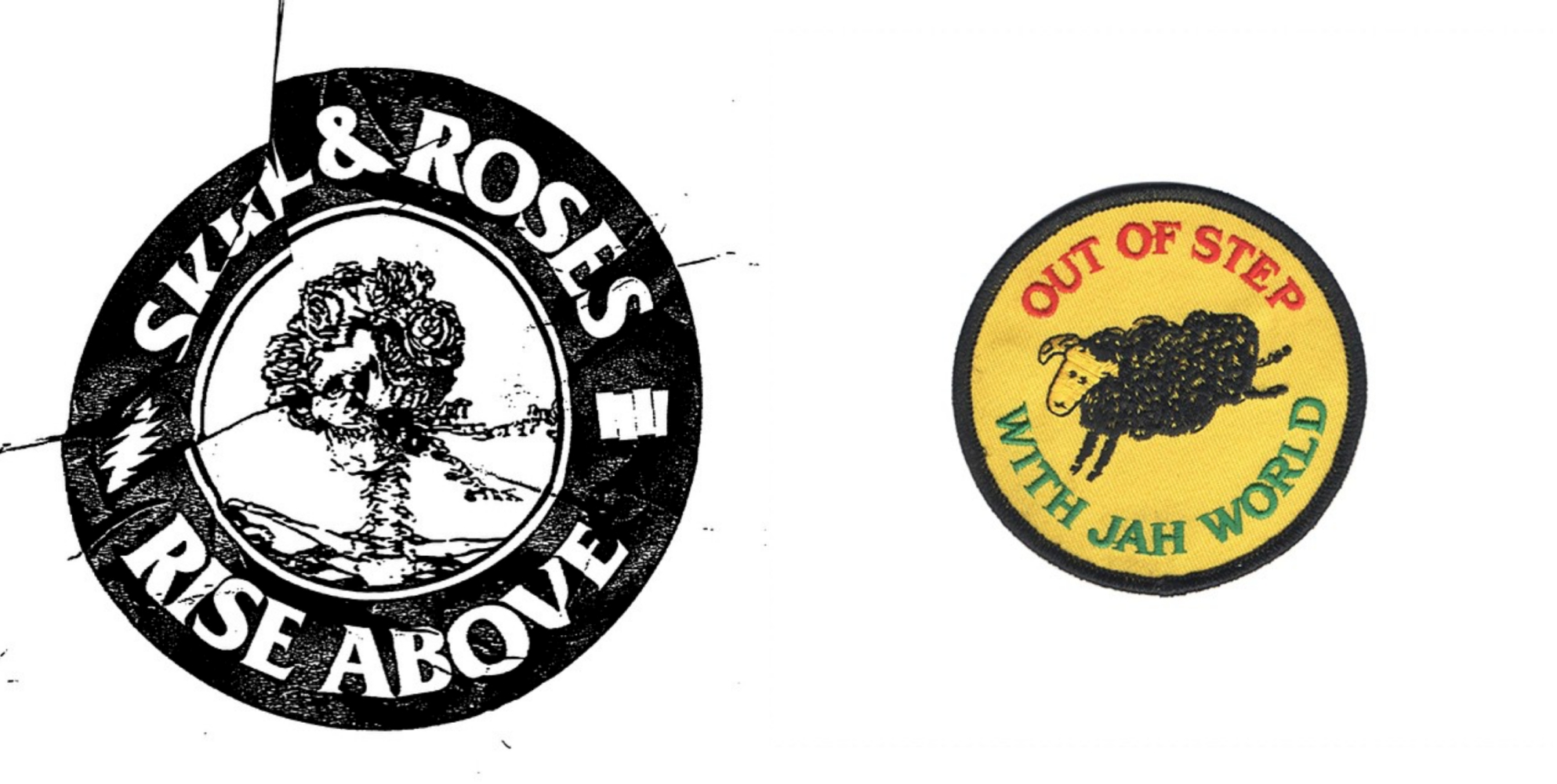
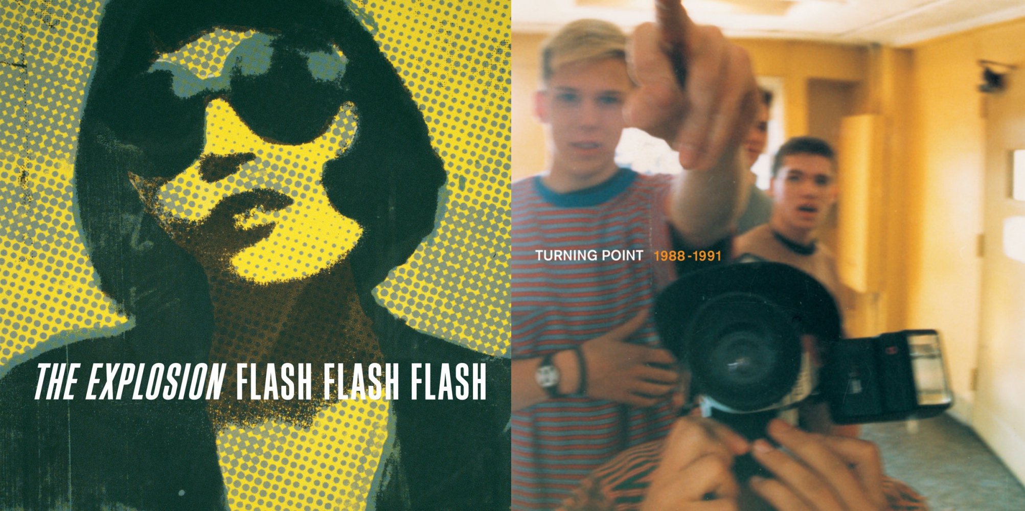
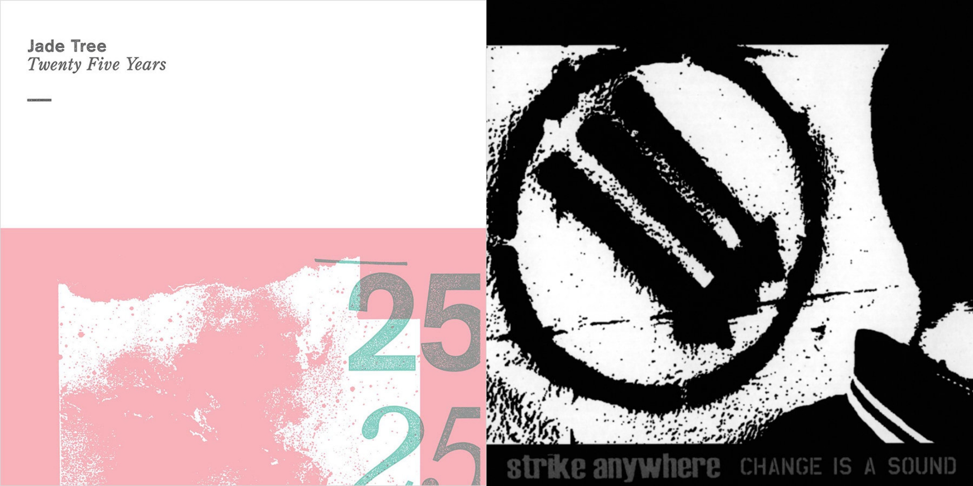
All following covers designed by Jeremy Dean:
You're known for your work within the Grateful Dead community. When and how did you first become a Dead fan? It's such a departure from hardcore!
I grew up around it and hated the idea of it. I wasn’t into anything “old” I wanted new, loud, and fast. I had some really good friends as well as my now wife who were fans of the Dead. I always blew it off. About 10+ years ago I decided to go back to all the stuff I always kind of either took for granted or kind of blew off as boring and really dig in.
I was also fascinated in the idea that Greg Ginn, and apparently, Henry Rollins were huge Dead fans. I dug deep and well…that was it.
For the folks who don’t know the band’s music, or assume they’ll hate it if they tried it, what album would you recommend they try first?
The first record to listen to is American Beauty then Workingman's Dead. Then dive into the 1977 live sets that are floating around out there. They tend to capture some of their most stellar moments.
Tell me about working with bands these days. Do you primarily choose to work exclusively with artists you’re a fan of, or do you also design for stuff outside of your taste zone?
In general I’ve been lucky that most of what I design for lines up with my musical tastes. It’s a good balance of bigger classic rock bands and smaller hardcore bands.
From a strictly design sense, how do you feel about what you’ve seen in the last few years in the hardcore scene?
I really like the way it has evolved. It’s gone back to a look and feel that balances between really raw and rough, but very considered design and some simple clean stuff with good typography. It’s an exciting time I think to be designing in that world. I think bands are open to different looks and the designer can hopefully run wild. If you are in a band and read this, please let the designer run wild!
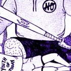
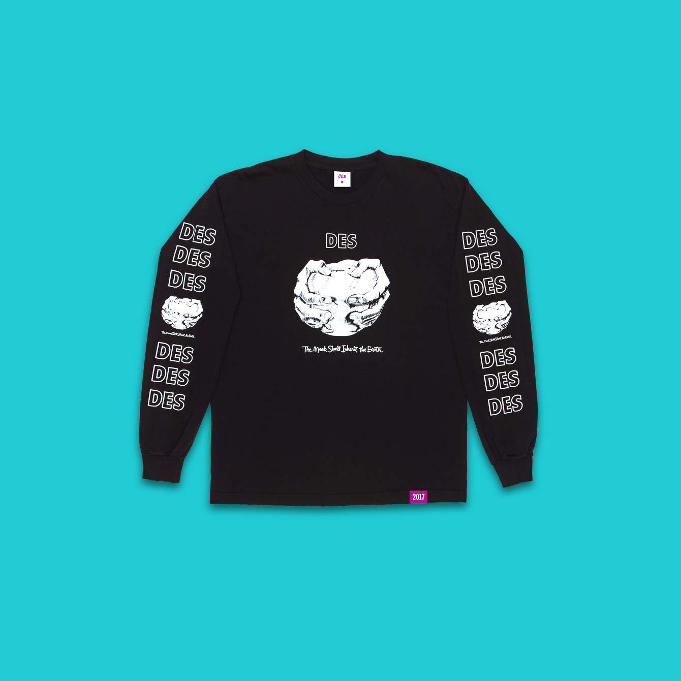
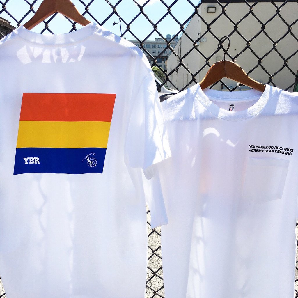
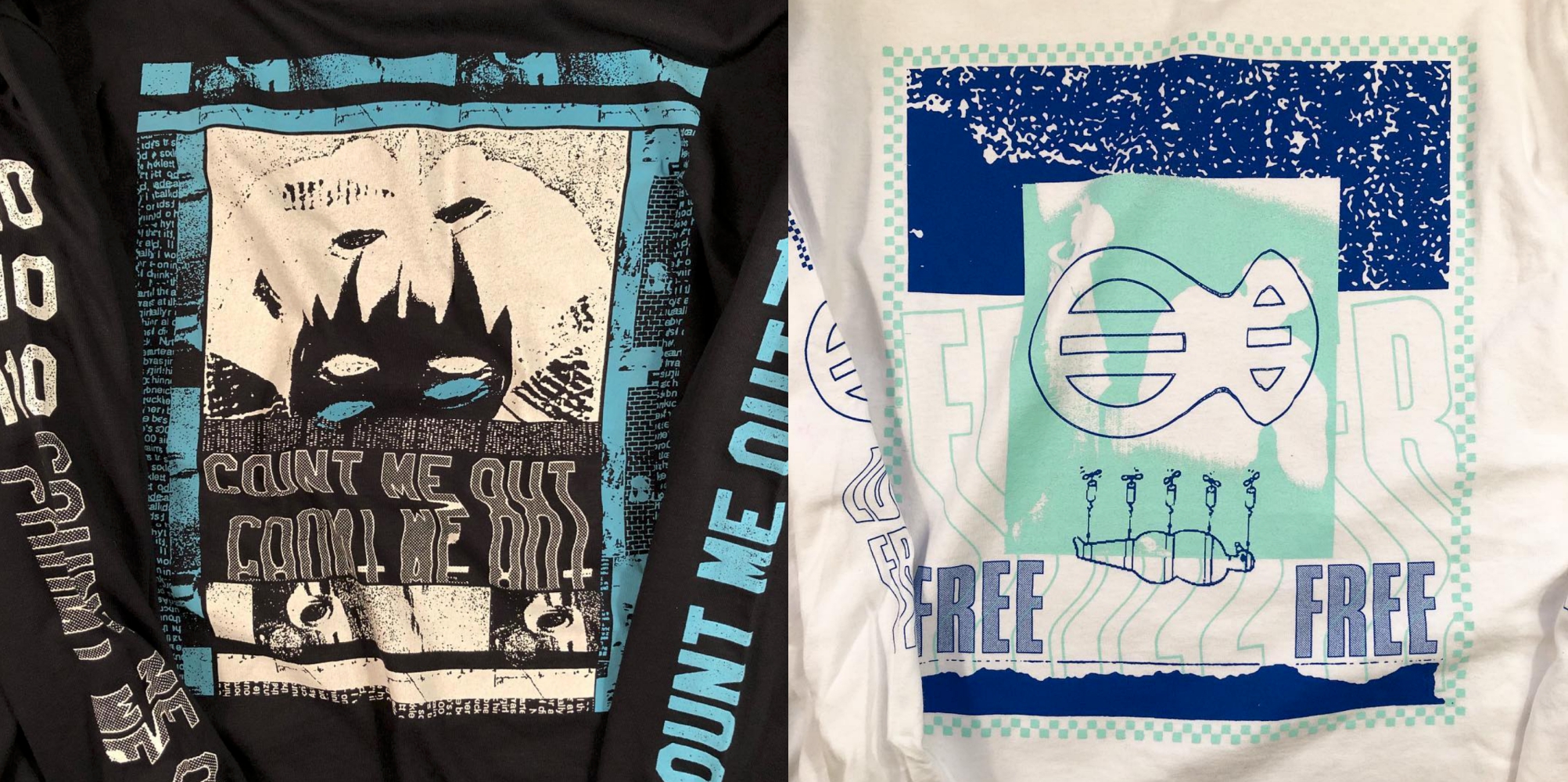
T-shirts designed by Jeremy Dean:
Of all the music-related designs you’ve done, which one would be your favorite?
I still really like the first Kid Dynamite LP. It was my first LP design. It was so much fun to do. I don’t look at it and get angry or what to change much, so I think that’s a good sign.
***
Follow Dean on Instagram and sign up for his newsletter so you don't miss any of his design drops.
Tagged: art spotlight, jeremy dean